Legal SEO and Web Design expert, Chris Dreyer, gives four tips to improve UX on a law firm website.
User experience (UX), or the overall experience while using a website, especially in terms of how easy or pleasing it is to use, is more important than ever in marketing as an attorney. UX can increase a website’s performance in search while also generating leads. It used to take much less rank well, but now Google also takes into consideration what users are doing after the clicking on your link.
Google evaluates how people interact with websites they find through their search. When people have a good experience (as evidenced by low bounce rates, high time on site and number of pages visited) Google ranks those sites higher.
Here are some best practices lawyers can follow to increase search rank and generate more leads.
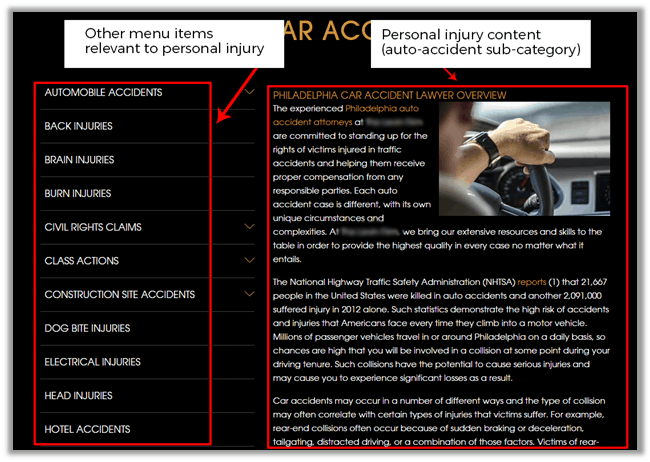
Practice Area-Specific Sidebars
Sidebars should be relevant or complementary to the main content of the page. For example, you don’t want family law links showing up in the sidebar of your personal injury landing pages. Sidebars can include different things, commonly this is where you may put contact forms or generic information about your firm.
Carefully place additional resources to prevent audience fatigue. This way, when a user has traveled deep enough into a topic area, there is no conflicting information to distract and prevent the audience from converting.
Going further, you can customize sidebars depending on the size of your website. Using the above example, you could have the sidebar relate to auto accidents. This may include what to do after a car accident, rear-end collision info, or a hit and run practice page.
Easy to Find and Use Contact Forms
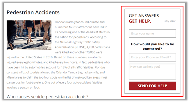
Contact forms are very common on a website and a good way to capture lead information. It’s also very easy to screw them up.
- Make them easy to find: As a best practice you should include a contact form on almost every page of your site. It doesn’t need to be in a popup or sidebar, but having it constantly present makes it easier to find.
- Make them short: Avoid unnecessary fields that might deter users from completing the form.
- Nail the validation: Validation is the programming that checks for things like accurately formatted emails, phone numbers, and that required fields have data in them. If your forms have validation, make sure they don’t annoy users by being too strict or deleting information when validation has failed.
A Clear Content Hierarchy
Content organization is extremely important because it helps people navigate to different areas of website. Lawyers should use content umbrellas to structure their site, meaning the site should have one overarching theme with sub-categories of pages underneath.
For instance a personal injury lawyer’s site would be about personal injury legal services. Each page of the site would be divided into different categories of personal injury legal matters like car accidents, slip and fall or motorcycle accidents. Organizing content in this way helps users find the most relevant information instead of wading through unnecessary pages.
Directional Cues
The internet is a nebulous place without landmarks or physical directional cues. You have to create those cues for people using menus, colors and other web design tactics.
Here are some examples of ways to direct visitors through your site:
Active menu items: Active menu items are a good way for users to determine which page they are on. Having the active page be a different color than the rest of the menu items is one example of this tactic.
Breadcrumbs: Breadcrumbs are navigational links that show people the path they’ve taken through a website. Attorneys should be leading users down a path through their website, and breadcrumbs help to show users where they are on that path and how to get back to the beginning if necessary.
Accurate page descriptions: When a person clicks on a ‘motorcycle accidents’, they are expecting legal information related to motorcycle accidents. Attorneys should provide that information at the top of the page; users shouldn’t have to do any additional searching.
Contact information on every page: A visitor could decide at any point that they want to speak with the attorney they are researching. Contact information should be available to them on every page of the site (typically in the header or footer).
Page speed: It may seem inconsequential, but considering the amount of legal websites and local attorneys, users have little incentive to wait on a page to load when they can just as easily back out and go to the next search result. Page speed affects organic rankings and impatient users will look elsewhere for information if forced to wait. Lawyers can use Google’s Page Speed Insights to check their page load times and get recommended fixes.
Make sure it all works: Above all else, make sure everything on your site works the way it is supposed to. On a regular basis check links and menu items on each page to ensure they are in working order. Make sure all your images load, contact forms work, menus function properly, etc. People can be forgiving, but too many issues with a website and they will leave and go to your competitor.
Putting these user experience design tips together will improve the experience users have while on your law firm’s site. In addition your site will rank higher in search, which can increase traffic and leads to your firm.


on said:
Great post. I was checking constantly this blog and
I’m impressed! Extremely helpful information particularly the last part 🙂
I care for such information a lot. I was seeking this certain information for a very long time.
Thank you and best of luck.